Almost every new user who learns how to use InDesign also has to learn quite a bit of typography and typesetting jargon, which can make the process a bit more complex than you might expect.
In this case, we’re not talking about the gutters along your roof or in the street, but there’s a bit of conceptual crossover since gutters in InDesign also act as channels – but these channels help to guide your reader’s attention.
Table of Contents
Key Takeaways
- Gutter is a typesetting term that refers to the space between two columns in a page layout design.
- Gutters prevent the reader’s eye from unintentionally switching between text columns.
- The width of gutters can be modified at any time in InDesign.
- Gutters sometimes contain ruled lines or other flourishes to provide additional visual separation between columns.
What is Gutter in InDesign
Some designers use the term ‘gutter’ to refer to the unprinted margin area between two facing pages of a book or multi-page document, but InDesign uses the term ‘inside margin’ to describe the same area.
When used in InDesign, the term ‘gutter’ always refers to the spacing between two columns.
Adjusting Gutters in Text Frames
Adjusting the gutter width between two columns in a text frame is extremely easy. Select the text frame that contains the gutters you want to adjust, then open the Object menu and click Text Frame Options.
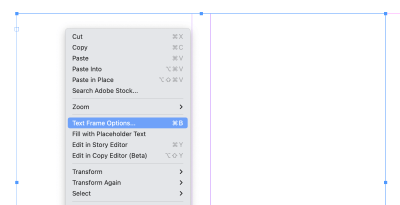
There are actually quite a few fast ways to access this panel: you can use the keyboard shortcut Command + B (use Ctrl + B on a PC), you can right-click the text frame and choose Text Frame Options, or you can hold down the Option key (use the Alt key on a PC) and double-click the frame using the Selection tool.
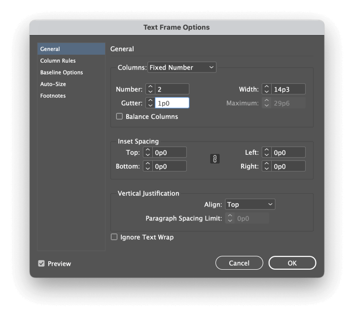
The Text Frame Options dialog window opens showing the General tab, which contains all the settings you need to control your columns and the gutters that run between them.
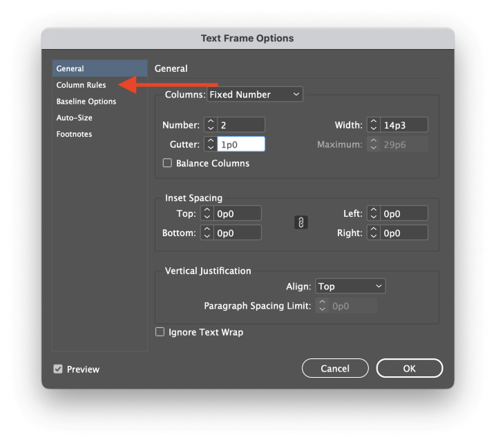
Attentive readers will note that there’s also a tab in the left pane labeled Column Rules. Click the tab to switch to it, and you’ll have the option to add a visual divider to your gutter. These are typically known as ‘rules’, but the term just refers to a simple straight line.
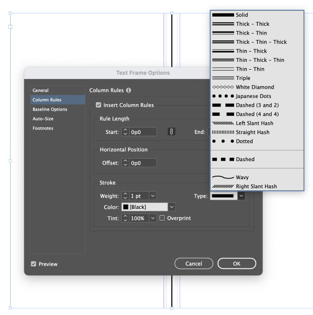
Despite the name, you’re not limited to using lines; you can also choose other embellishments and flourishes to help guide the reader’s attention where you want it to go.
Unfortunately, there isn’t an option to use completely custom column rules, but perhaps that will be added in a future update.
Adjusting Gutters in Column Guides
If you configured your document to use column guides during the new document creation process, you can still adjust the gutter spacing without creating a whole new document. Open the Layout menu and select Margins and Columns.
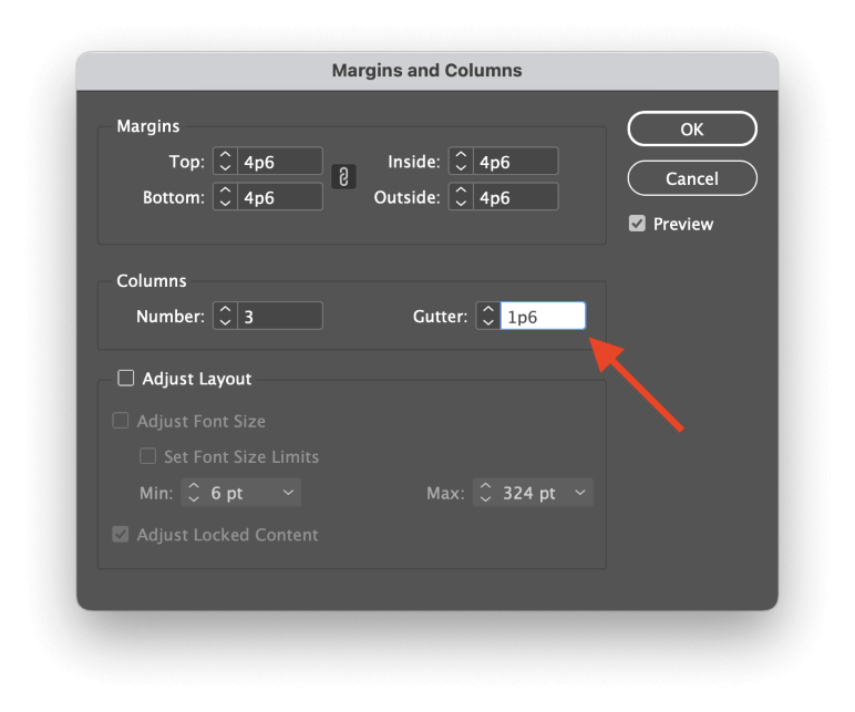
In the Margins and Columns dialog window, you can adjust the gutter size as needed.
You can also adjust column gutter placement manually by opening the View menu, selecting the Grids and Guides submenu, and disabling the Lock Column Guides setting.
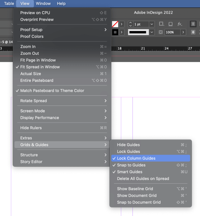
Switch to the Selection tool using the Tools panel or the keyboard shortcut V, then click and drag one of the gutter lines to reposition the entire gutter. This method won’t allow you to change the gutter width, but you can freely reposition them to visually adjust your column widths.
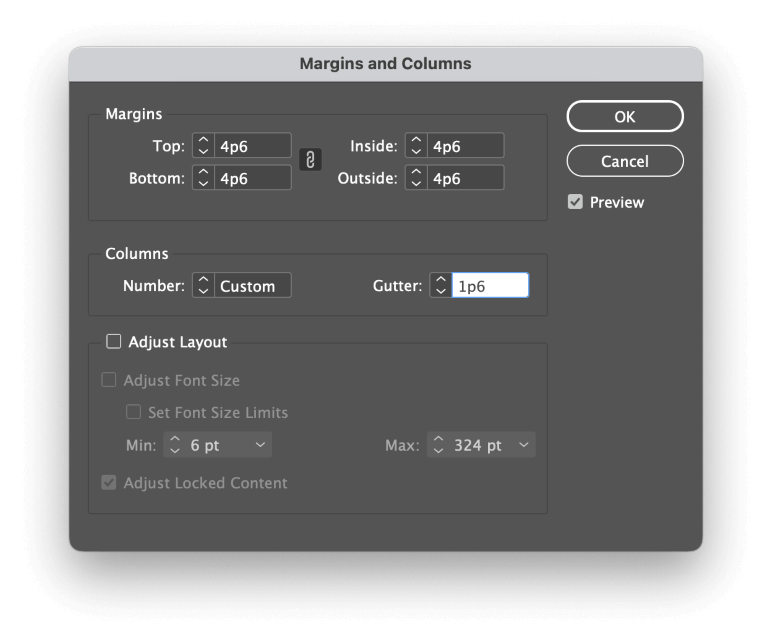
The Number setting displays Custom if you’ve adjusted the column placement manually
If you want to reset your gutters after playing around with them, open the Margins and Columns window again from the Layout menu and re-enter your previous column and gutter settings.
Choosing the Perfect Gutter Size in InDesign
The typesetting world is full of ‘ideal’ rules that get broken quite regularly, and gutter spacing is no exception. The conventional wisdom about gutter width is that it should at least match or exceed the size of the typeface used in the columns, but that it should ideally match or exceed the size of the leading used.
While this can be a useful guideline, you’ll quickly find that it’s not always possible to meet these requirements. Column rules can help reinforce the distinction between closely-set columns, as you’ll often see in newspapers, magazines, and other situations where space is at a premium.
When choosing a gutter width, remember that the main purpose of a gutter is to prevent the reader’s eye from accidentally jumping over to the next column instead of going down to the next line of text.
If you can accomplish that goal while still making it look good, then you’ve selected the perfect gutter width.
A Final Word
That’s just about everything you’ll ever need to know about gutters in InDesign, as well as in the wider world of typesetting. There’s a lot of new jargon to learn, but the quicker you get familiar with it, the sooner you can get back to creating beautiful and dynamic InDesign layouts.
Happy typesetting!
