InDesign is an incredibly powerful page layout application that allows you to do almost anything you can imagine to your text. While that’s a great claim to fame, the downside is that some simple tasks can get buried under a mountain of unrelated panels, icons, and dialog boxes.
Centering text vertically in InDesign is extremely easy – as long as you know where to look and what to look for.
In this tutorial, I’ll show you a couple of ways to center text in InDesign.
Table of Contents
Method 1: Centering Your Text Vertically in InDesign
The first trick to creating vertically centered text is that the setting gets applied to the text frame itself, not to the text contents.

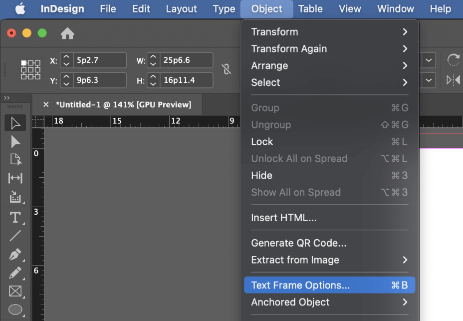
Using the Selection tool, select the text frame containing the text you want vertically centered, and press the keyboard shortcut Command + B (use Ctrl + B if you’re using InDesign on a PC). You can also open the Object menu and select Text Frame Options, or right-click on the text frame and select Text Frame Options from the popup menu.
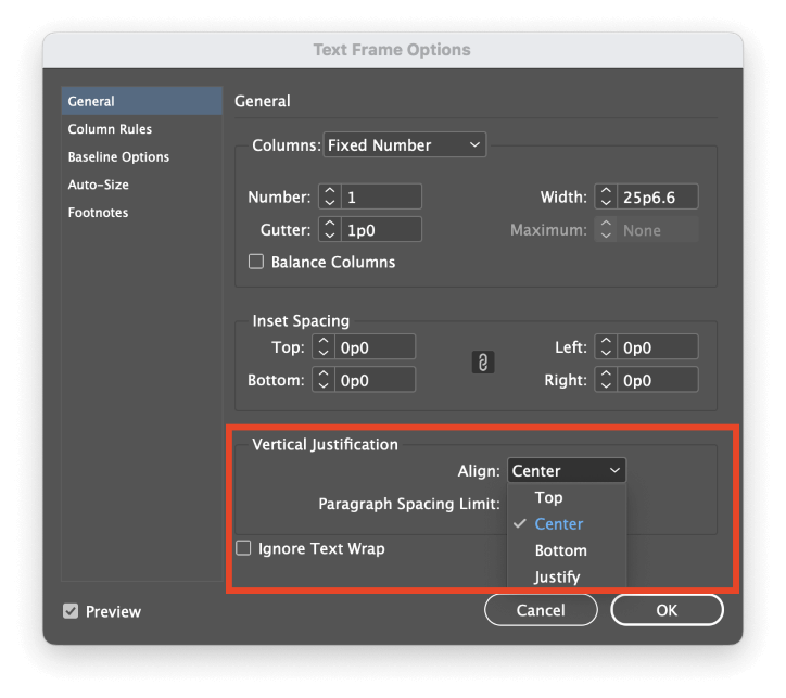
InDesign will open the Text Frame Options panel, presenting the second trick: instead of being called vertical centering, the option you need is called Vertical Justification.

Open the Align dropdown menu, and select Center. You can also enable the Preview setting to confirm that you’re getting the desired results, then click the OK button.

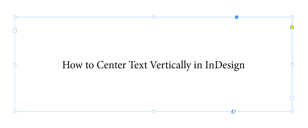
That’s all there is to it! Any text within that text frame will be centered vertically.

Once you understand how it all works, you can accomplish the same goal using the Control panel. Select your text frame with the Selection tool, and click the Align Center button shown above.
Working With Vertically Centered Text
Now that you know how to apply vertical centering in InDesign, it’s important to make sure that you’re using it properly. While it can be useful in some situations, it can also cause problems – or just make more work for you – if it’s used incorrectly. It’s often simpler to just avoid using it at all!
Because the vertical centering property applies to the text frame itself and not directly to the text contents, you can get unexpected results if you combine vertical centering with threaded text frames.
If your threaded text is adjusted in another part of the document, the section that fits into the vertically centered text frame can change without you realizing it, which can wreck your entire layout.
You can also run into issues with vertical centering if you combine it with baseline grid alignments in your paragraph options. These two settings can cause conflicting results, but InDesign doesn’t notify you of the potential issue, so you may waste a lot of time trying to figure out why you’re not getting the expected alignment.
Method 2: Setting Text Vertically in InDesign
If you’re designing a project that requires vertically-oriented text, such as the spine of a book, then it’s even easier to center it!
Switch to the Type tool using the Tools panel or the keyboard shortcut T, then click and drag to create a text frame and enter your text. When you’re satisfied with the styling, apply the Align Center option using the Paragraph panel.

Next, switch to the Selection tool using the Tools panel or the keyboard shortcut V. Select your text frame, then locate the Rotation Angle field in the Control panel at the top of the main document window. Enter -90 into the field (that’s minus 90!) and press Enter.
Your text is now vertical and still centered within the text frame!
Which Way Should Vertical Text Face?
For languages with left-to-right reading order, the standard practice in the publishing industry is to align the text so that the text baseline sits on the left side of the spine.
When someone is reading the spine of your book on a shelf, they will tilt their head to the right, reading from the top of the spine down towards the bottom. There are occasional exceptions to this rule, but the vast majority of books follow it.
A Final Word
That’s all there is to know about how to center text vertically in InDesign! Keep in mind that it’s often easier to just create a text frame that matches your text contents exactly and then position that frame manually for the perfect layout. Vertical centering is a great tool, but it’s not the only way to solve that particular design problem.
Happy centering!
