InDesign is an excellent typesetting tool, but it has so many features that it can feel a bit overwhelming for new users. Once you get used to working with the Type tool, you may start to wonder how you can break up your linear and angular layouts with some more interesting typographic options.
Curving text is a great way to shake things up but InDesign handles the text input process much differently than it does for other text areas, so let’s take a look at how you can use it in your next project.
Table of Contents
Key Takeaways
- Curved text is created using the Type on a Path tool
- Vector paths for curved text can be regular or freeform vector shapes
Step 1: Creating a Curved Vector Path in InDesign
To begin the process of creating curved text in InDesign, you need to create a curved vector path.
If you want to place your text around a perfect circle, you can use the Ellipse Tool, or you can create a more freeform curved path using the Pen Tool.
Using the Ellipse Tool
If you want to curve text around a circle, the best option would be using the Ellipse Tool.
Switch to the Ellipse Tool using the keyboard shortcut L. You can also use the Tools panel, although the Ellipse Tool is nested under the Rectangle Tool.
Click and hold or right-click on the Rectangle Tool’s icon to display a popup menu of all the tools nested in that location.
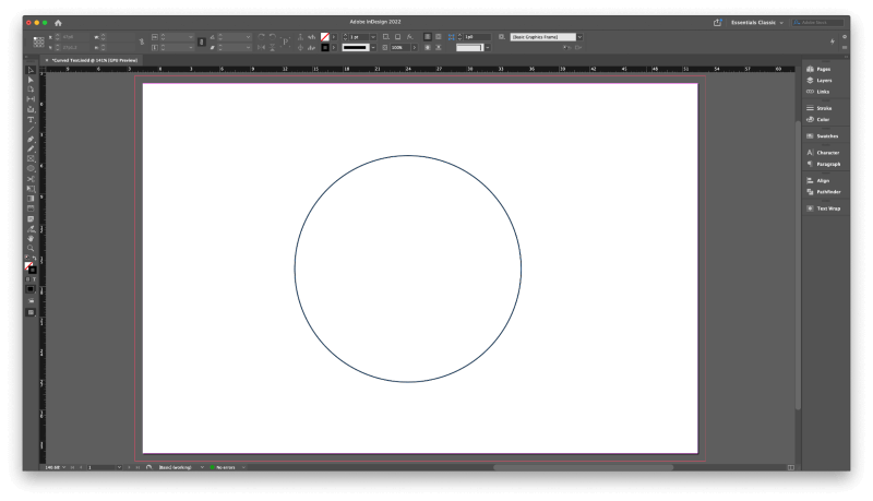
Hold down the Shift key, then click and drag in the main document window to create a circle. The Shift key acts as a constraint to make sure that the height and width are the same, which creates a perfect circle, but you can also leave it out to create an ellipse.
Using the Pen Tool
To create a more freeform curved path for your text, switch to the Pen Tool using the Tools panel or the keyboard shortcut P.
Click in the main document window to place the first point of your curve, then click and drag to create a second point and adjust the curvature of the line between the two points.
Repeat as many times as necessary until you’ve created the curve you want.
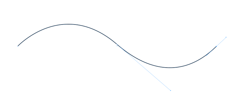
If the shape doesn’t come out perfectly using the click and drag method to control the line’s curves, you can also adjust each point separately afterward using the Direct Selection Tool. Switch to the Direct Selection Tool using the Tools panel or the keyboard shortcut A.
Click one of your anchor points, and handles will appear that allow you to control the angle of the curve as it reaches that anchor point.
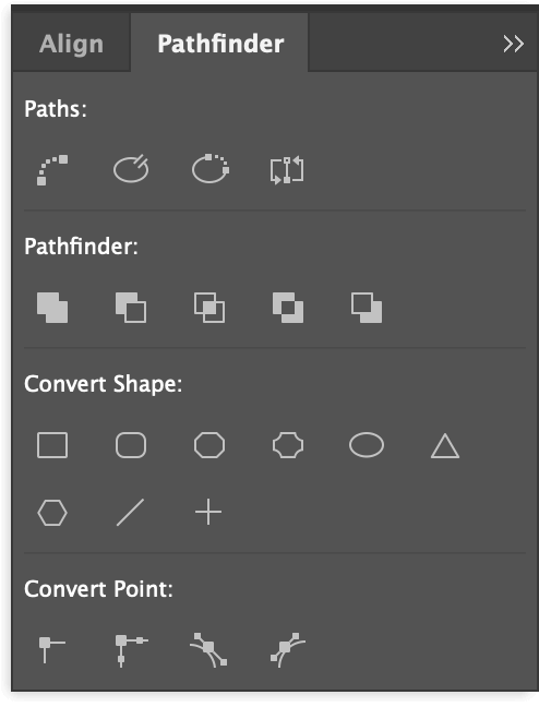
For advanced control of your path, you can open the Pathfinder panel by opening the Window menu, selecting the Object & Layout submenu, and clicking Pathfinder. The Convert Point section of the Pathfinder window is especially helpful for fine-tuning your lines.
Step 2: Placing Your Text on the Path
Now that you’ve got your vector shape in place, it’s time to add some text! If you try to use the regular Type tool, InDesign will treat your vector shape like a clipping mask, and it will place your text inside the shape instead of along the path itself.
The trick to creating curved text in InDesign is to use the Type on a Path Tool.
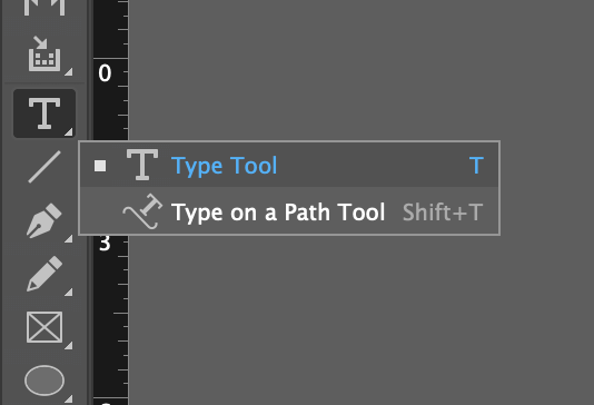
The Type on a Path Tool is located in the Tools panel, nested under the regular Type tool.
Click and hold or right-click on the Type tool to see the popup menu of the other tools nested in that location, or you can switch to the Type on a Path Tool directly by using the keyboard shortcut Shift + T.
With the Type on a Path Tool active, move your cursor over the path you created. A small + sign will appear next to the cursor, which indicates that InDesign has detected a path that can contain text.
Click once on the path where you want your text to start and enter your text using the keyboard. If you’re using a freeform path created with the Pen Tool, InDesign will automatically start your text at the first anchor point of the path.
Don’t worry if it isn’t in exactly the right place yet! The first step is to get the text onto the path, and then you can adjust its position.
You can adjust your text’s start and end position using the Selection Tool. Switch to the Selection Tool using the Tools panel or the keyboard shortcut V, and select your path.
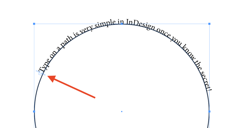
Look closely at the path holding your text, and you’ll see two marker lines. If you’re using a freeform line, the markers will be placed at the beginning and end of your path, but if you’re using a circle or ellipse, they will wind up placed almost right next to each other because a circle doesn’t technically have a start or end.
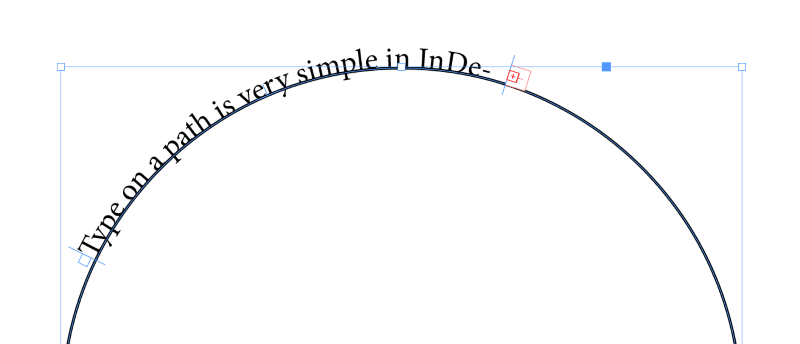
You can click and drag these lines to reposition the start and endpoints of the text area. Pay close attention to the cursor icon as you mouse over the marker lines, and you’ll see a small arrow appear. The right arrow indicates that you’re selecting the start marker line, while the left arrow indicates the end marker line.
Step 3: Fine-tuning Your Curved Text
Now that you’ve got your text placed on your curved path, you can start to adjust its style and position.
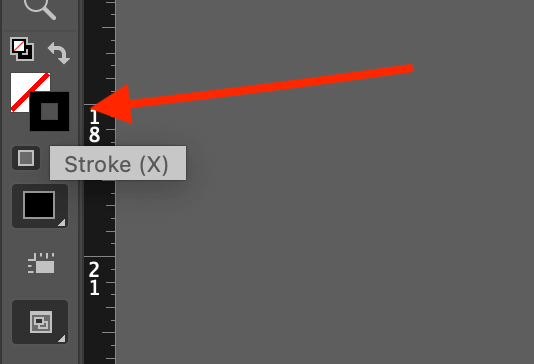
Unless you want the path itself to stay visible, make sure your path or shape is selected and then change the current Stroke color setting to None, which is represented by a white box crossed with a diagonal red line.
You can do this using the swatches at the bottom of the Tools panel (see above) or using the dynamic Control panel that runs across the top of the main document window (see below).
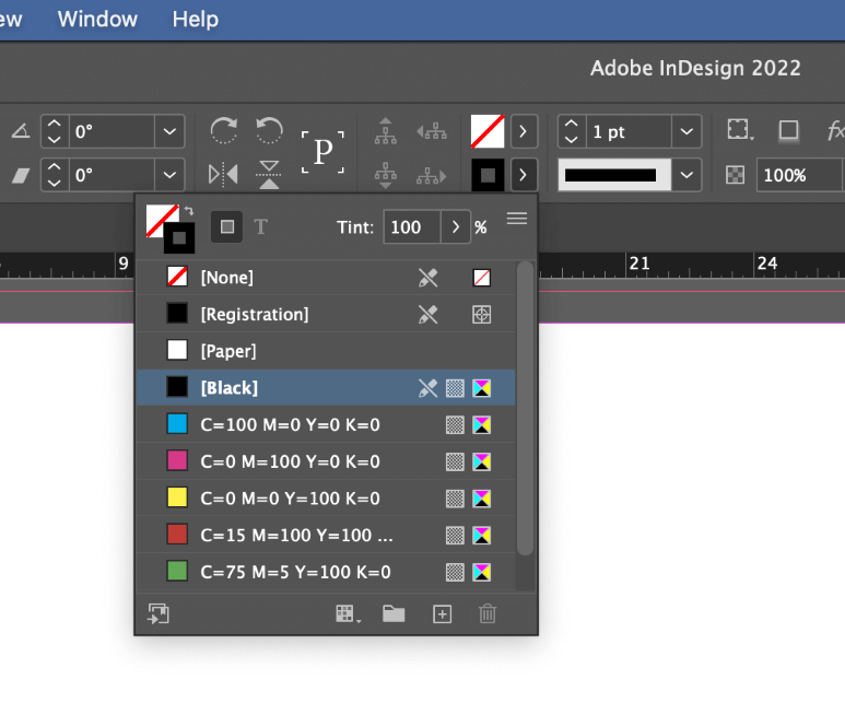
This makes it a lot easier to see what you’re doing and gives you a much clearer picture of what the finished result will look like without the pesky stroke line in the way.
To control where your text sits on your path, make sure it’s selected, then double-click the Type on a Path Tool icon in the Tools panel. InDesign will open the Type on a Path Options dialog window.
You can also right-click on the path in the main document window, select Type on a Path from the popup menu, and click Options, but this is only available in the menu while your text path is still active, so it’s simpler to use the icon double-click method.
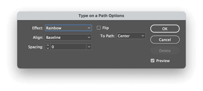
The Effect dropdown menu allows you to customize how each character will be placed on the path. While some of the effects are interesting, for most applications, the default Rainbow option is the best way to create curved text.
The Align setting allows you to choose which part of the text is used as the alignment point.
Ascender refers to the portion of a lowercase letter that extends above the main text line, like in the letters b, d, k, l, and so on.
Descender is similar but refers to the part of a letter that extends below the main text line, found in a lowercase g, j, p, q, and y. Center and Baseline are fairly self-explanatory options.
The To Path options work in tandem with the Align setting, but you may not notice much of a variation depending on the other settings that you’ve chosen.
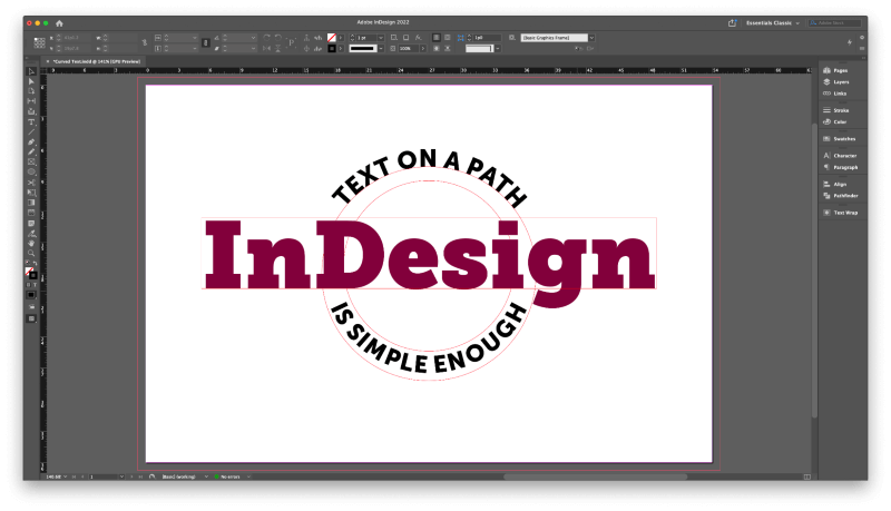
Last but not least is the Flip option, which places your text on the other side of the path. This is necessary for creating concave text on a path, as you can see in the final example below.
A Final Word
That’s everything there is to know about how to curve text in InDesign. Whether you call it a simple curve or a grand arch, it’s easy enough to do once you know how to find and use the Type on a Path Tool. Just keep in mind that curved text can be difficult to read, so it’s usually a good idea to only curve a few words instead of long sentences.
Happy curving!
