Krita is a digital drawing app that is more focused on providing enhanced painting tools for creating unique artwork. This free app has a lot to offer to experienced digital artists who want to focus purely on drawing, painting, or animation at a low price point.
Procreate is a digital design app that offers a robust selection of painting tools alongside an exciting array of graphic design functions and photo editing options. This means the Procreate covers all bases so users have few reasons to work with any other digital design software.
Overall, for me, Procreate is a clear winner here. Not only it’s user-friendly, but it’s an all-encompassing app for most design needs and at a very good value for the price.
I’m Carolyn and I’ve been using Procreate to run my digital illustration business for over three years which means I know the app like the back of my hand. But I also like to explore different programs to see what they have to offer and if they can improve my design knowledge.
Today I’m going to walk you through the main differences between Krita and Procreate and show you why I made my choice.
Table of Contents
Quick Comparison
Here is a quick overview of the main differences between Krita and Procreate:
| Krita | Procreate | |
| User Experience | Stylus only | Finger and /or stylus |
| Compatibility | Not on iPad or iPhone but offers desktop version | iPad/iPhone only |
| Main Focus | Painting | Painting, drawing and photo editing |
| Animation Features | Advanced animation options | Basic animation options |
| Pricing | Free or donation only | $12.99 USD one-time fee |
| Brushes | 120+ brushes | 200+ brushes |
| Design Features | seExpr, no blending tool or 3D drawing | 3D Drawing and blending tools |
| Ease of Use | Steep learning curve, less online support | Easy to use, many tutorials available online |
Krita vs Procreate: Detailed Comparison
Below, I have created a detailed breakdown comparing the two apps in terms of the user experience, compatibility, main focus, animation features, pricing, brushes, design features, and beginner experience (ease of use).
User Experience
Procreate has designed a simple and clear gallery and canvas home screen that makes navigating the app and all of its tools easy and seamless. Users are able to use a touchscreen to draw with their own finger and the app works with a stylus for a well-rounded experience.
The app was designed specifically for use with the Apple Pencil so what you can create with this stylus is jaw-dropping. It mimics the illusion of drawing on paper with the added bonus of being able to switch between the stylus and finger drawing for accuracy and fluid movement.
This feature, for me, is Krita’s biggest downfall. For an app that is solely based on creating digital artwork, not being able to use multiple tools as one would do in real-life art creation, is strangely absent from this otherwise well-designed app.
Users are limited to creating on Krita using a keypad and a mouse whilst peering into a desktop monitor. This has a huge restrictive effect on user experience as you cannot fully engage with your artwork or move your device to suit your own drawing technique.
Winner: Procreate. Procreate is compatible with a touchscreen and a stylus. Krita is limited to a keypad and mouse which limits the artistic experience.
Compatibility
Procreate was developed and designed specifically for use with the Apple iPad or Apple iPhone for their smaller version, Procreate Pocket. It is not compatible with any Android device, or any Windows operating system and it doesn’t offer a desktop option, not even for a MacBook.
This limits Procreate access to Apple users who have access to an iPad or iPhone. This also makes it difficult when working between multiple design programs because it reduces your options in terms of file types and sharing abilities. Overall, this can be inconvenient for some.
Krita is available for download on Windows and Mac desktops. There is no handheld device version of the app so users cannot access the program using smartphones, iPads, or regular tablets.
This limited access to the app is hopefully a short-term limitation as it reduces the number of people who can access and use this creative platform. This has a domino effect on the digital art community as fewer users mean fewer resources and fewer conversations about the app.
Winner: It’s a tie. Both Procreate and Krita are limiting users by only offering their app for use on one or two specific devices.
Main Focus
Krita is a sophisticated digital design app that is focused on creating drawings, illustrations, and paintings. Because the focus is on creating art, it doesn’t have as much selection of different tools as other apps may have. The developers have kept it focused on painting.
If you plan on using multiple design apps for different functions when creating artwork, then Krita in conjunction with other apps can provide some really awesome variations in your projects. But this means having the time to download and work with multiple apps at one time.
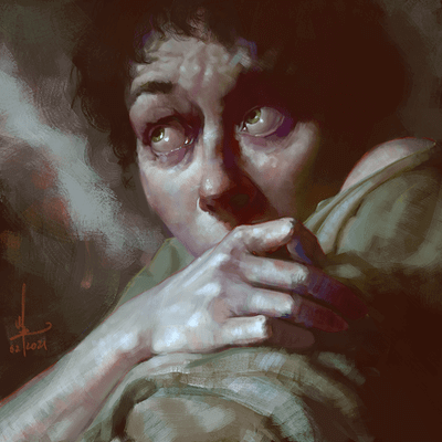
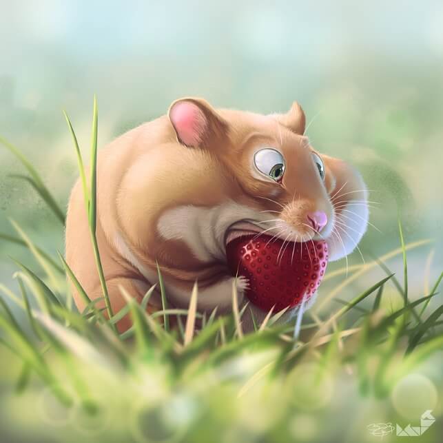
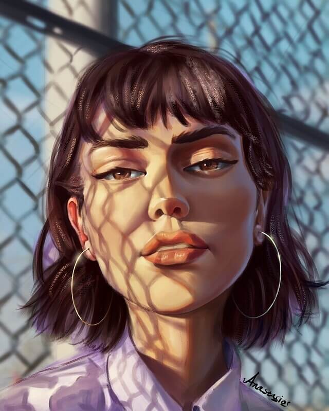
Procreate, on the other hand, has covered it all and offers users bonus tools that allow them to draw, edit photos, create 3D designs, and use live models for their FacePaint feature. And without sacrificing the quality of any of its many painting features.
So even without having one main focus, Procreate provides an incredibly advanced drawing app that leaves its users needing nothing else. This is why you may find that people who primarily use Procreate generally have no need to download and learn any other design app.
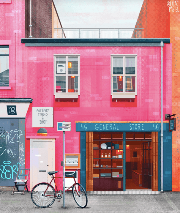
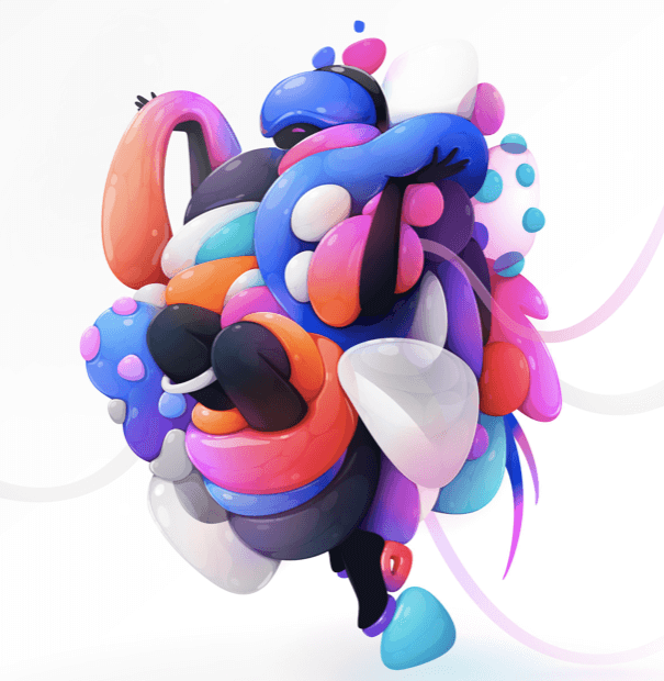
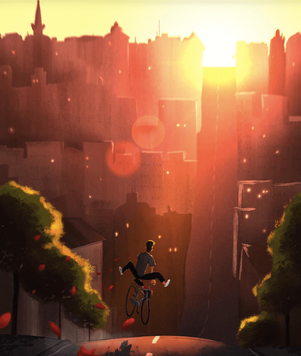
Winner: Procreate. Procreate’s main focus is digital artwork with a holistic approach. Krita is mostly focused on painting.
Animation Features
Having used the animation tools in Procreate, I must say that there is room for improvement and I have no doubt that it’s on the way in future updates. However, as of today, I would rate the ability to create animations using the Procreate tools available as useful but basic.
The developers of Procreate have provided their Animation Assist tool to create basic animations and GIFs using a frame-by-frame technique. This allows users to make their drawings come to life by adding multiple layers and editing quick frame settings together.
In the Krita app, you can actually create your own storyboard for your animation which makes the process even more enjoyable. It also consists of extra animation techniques that can help improve the quality and variety of options the user can create with.
As with Procreate, you can work frame-by-frame on Krita. However, you also have some added control by having the ability to add tweening (in between poses) frames to create more fluid movement. The Animation Curves Docker also allows you to edit minor tweening too.
Winner: Krita. Krita provides more in-depth and detailed animation techniques than Procreate.
Pricing
Krita is a free design app. Believe it or not, this app is developed and created by a team of volunteers. Their progress relies heavily on donations which of course are optional but provide them the ability to maintain and develop their app even further.
You can see where your money goes and donate by clicking here.
Procreate is currently $12.99 USD in the App Store. It’s a one-time fee that gives users access to the full app and all of its amazing features.
Winner: Krita. Krita offers its full, open-source app at no cost to its users.
Brushes
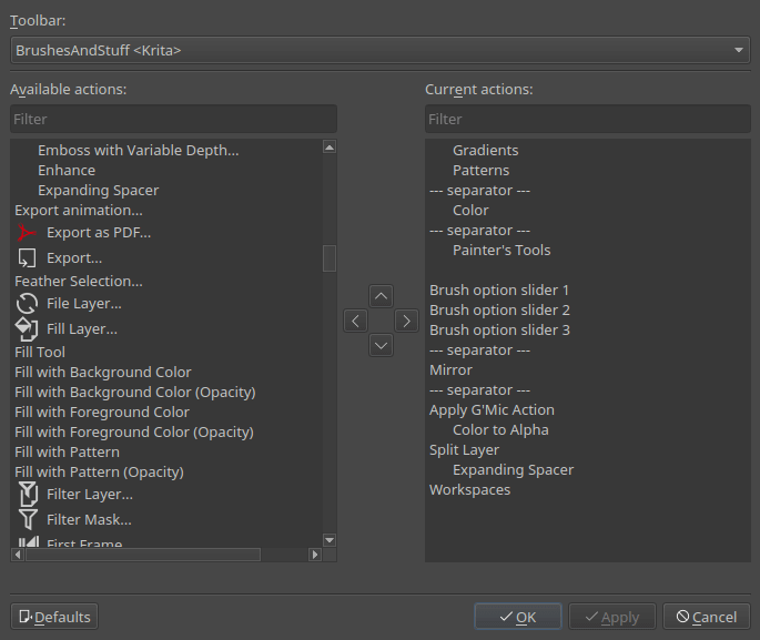
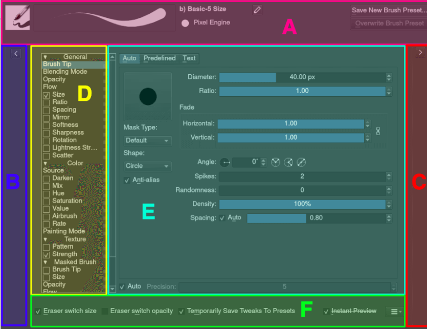
Krita has fewer brush options to Procreate (Just over 120 brushes) but it also has the ability to create your own brushes. However, this can be quite the challenge for beginners as the brush menu is confusing and overcrowded which makes it more time-consuming to pick up.
Krita offers a vector graphics option which frequently gets confused with brushes. It allows you to create vectorized shapes using their own tool.
Procreate has over 200 pre-loaded brushes already available to you in the Brush Library. You also have unlimited options to create your own brushes or purchase and import brushes made by other artists. This process is quick and simple and the options are endless.
Procreate only offers pixel brushes as it is a raster graphics-based program and does not support any vector graphics options.
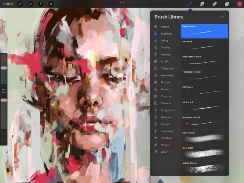
Winner: Procreate. Procreate has a bigger selection of brushes and they are easier to find, edit and use.
Design Features
As Krita is more focused on the painting aspect of digital artwork, it doesn’t provide as many design features as the Procreate app. However, it does possess some unique qualities and brushes that can create some really beautiful results.
Krita offers seEXpr, which is a procedural graphic tool that can essentially code your artwork. It is a language generator tool created by Disney Animations and essentially turns your artwork into a formulaic equation. It’s a pretty cool option If you can figure out how to use it.
As Procreate provides a bigger selection of design tools, there are some incredibly useful things that you can do in the app that won’t be available to you in Krita. This is where the user-friendly design features really become evident to the everyday user.
For example, you can use the Gaussian Blur and Smudge Tool to create perfect gradients and blur in the app that you cannot do in Krita. The app has also updated us with the 3D Design function which means you can design and create artwork directly onto a real-life object within your canvas.
Winner: Procreate. Although seEXpr is incredibly unique, it’s rare that a regular artist would ever need to use this. Therefore the Procreate design features provide more value to its users.
Ease of Use
Procreate is designed with its users in mind. It has a clear and simple, no-frills attached home screen that allows you to easily view and navigate your way through all of its incredible features. It’s a very quick learning curve because the app is so easy to use.
Apart from the visual ease of the app, the Procreate Handbook is available online and quickly and clearly can answer every single question you could ever have. Because the app is more popular with artists, the online resources and tutorials are vast in comparison to the Krita app.
Krita is not the best option for beginners and is best suited for a more established or experienced digital artist. Its interface, designed for a desktop, can be overwhelming and overloaded with information which makes it difficult to learn how each tool actually works.
On top of this, their user manual that is available online is full of technical jargon and long-winded guides that go around in circles. It’s not concise and it’s hard to find the answer you’re looking for quickly. And if you look for help elsewhere, online resources or tutorials are sparse.
Winner: Procreate. This app is simple and easy to use with access to endless resources where you can easily find the answer to anything you need. Krita lacks this solid, condensed information.
Final Verdict
I can appreciate the technical sophistication of the Krita app and the fact that this valuable design program is free is amazing. But unless you have lots of time dedicated to just this app, it can be a tedious and challenging road to attempt to use its awesome features and tools.
Procreate is more pricey but it offers everything you could ever need in one app. The work produced on both of these apps is on par so there’s no reason to even use Krita if you’re already established on Procreate.
Do you use Krita or Procreate or both? Share your preference in the comment section below and let me know why you made that choice.
