Writers need an app that makes their process as friction-free as possible, assisting them to brainstorm and generate ideas, get the words out of their heads, and create and rearrange structure. Extra features are useful but should stay out of the way until they are needed.
There is a lot of variety in the writing software genre, and learning a new tool can be a big-time investment, so it’s important to consider your options before making a commitment.
Ulysses and Scrivener are two of the most popular tools out there. Which one should you use? This comparison review gives you the answer.
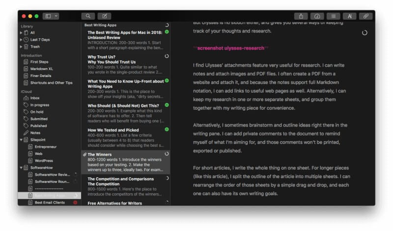
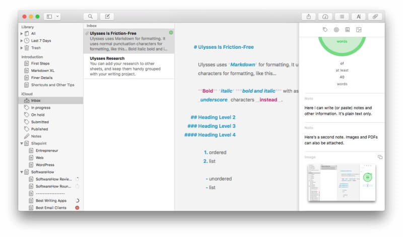
Ulysses has a modern, minimal, distraction-free interface that allows you to create a large document piece-by-piece, and uses Markdown for formatting. It includes all the tools and features you need to take their project from concept to published work, whether it’s a blog post, training manual, or book. It’s a complete writing environment, and claims to be “the ultimate writing app for Mac, iPad and iPhone”. Note that it’s not available for Windows and Android users. Read our full Ulysses review here.
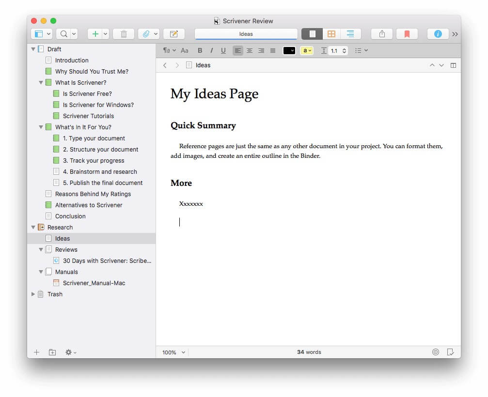
Scrivener is similar in many ways, but focuses on a rich feature set rather than minimalism, and specializes in long-form documents, such as books. It functions like a typewriter, ring-binder, and scrapbook—all at the same time—and includes a useful outliner. This depth can make the app a little difficult to learn. It’s also available for Windows. For a closer look, read our full Scrivener review here.
Table of Contents
Ulysses vs. Scrivener: How They Compare
1. User Interface
In broad terms, the interface of each app is similar. You’ll see a pane where you can write and edit the current document on the right, and one or more panes giving you an overview of your entire project on the left.
Ulysses stores everything you’ve ever written in a well-designed library, while Scrivener is more focused on your current project. You access other projects using File/Open on the menu.
Scrivener resembles the word processing program you’re already familiar with, using menus and toolbars to perform most functions, including formatting. Ulysses has a more modern, minimalist interface, where most tasks can be performed using gestures and a markup language instead. It’s more similar to a modern text or Markdown editor.
Finally, Scrivener has a focus on functionality, while Ulysses seeks to ease the writing process by removing distraction.
Winner: Tie. Since the last (Mac) update of Scrivener, I really enjoy both user interfaces. If you’ve been using Word for years, you’ll find Scrivener familiar, and it contains powerful features that are particularly useful for long-form writing projects. Ulysses offers a simpler interface that fans of Markdown will love.
2. Productive Writing Environment
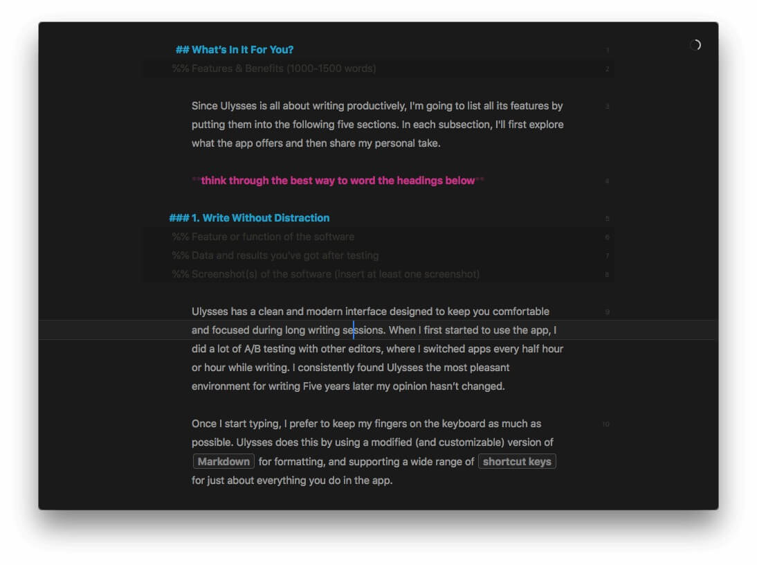
Both apps offer a clean writing pane where you can type and edit your document. I personally find Ulysses superior for distraction-free writing. I’ve used a lot of apps over the years, and something about it just seems to help me to focus and write more productively. I know that’s very subjective.
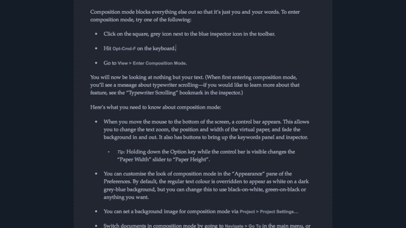
Scrivener’s Composition Mode is similar, allowing you to immerse yourself in your writing without being distracted by toolbars, the menu, and additional panes of information.
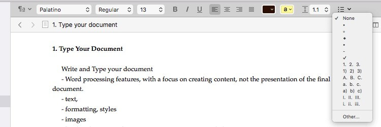
As I mentioned briefly above, the apps use very different interfaces for formatting your work. Scrivener takes its cues from Microsoft Word, using a toolbar to format rich text.
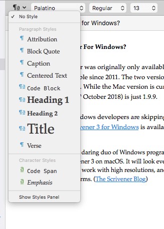
A wide variety of styles are available so that you can focus on content and structure rather than making things pretty.
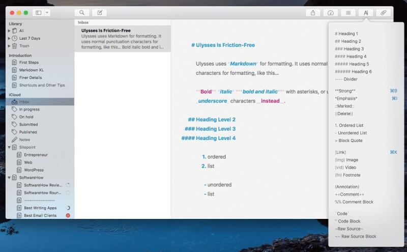
By contrast, Ulysses uses Markdown, which simplifies formatting for the web by replacing HTML code with punctuation characters.
There’s a bit of learning to do here, but the format has really caught on, and there’s an abundance of Markdown apps. So it’s a skill worth learning and allows you to perform a host of formatting operations without removing your fingers from the keyboard. And speaking of keyboards, both apps support familiar shortcuts like CMD-B for bold.
Winner: Ulysses. Scrivener is one of the best writing apps I’ve used, but there’s something about Ulysses that keeps me typing once I start. I haven’t encountered any other app with such little friction when immersed in the creative process.
3. Creating Structure
Instead of creating your entire document in one big piece the way you would with a word processor, both apps allow you to break it up into smaller sections. This helps you to be more productive because there’s a sense of achievement when you complete each part, and it also makes it easier to rearrange your document and see the big picture.
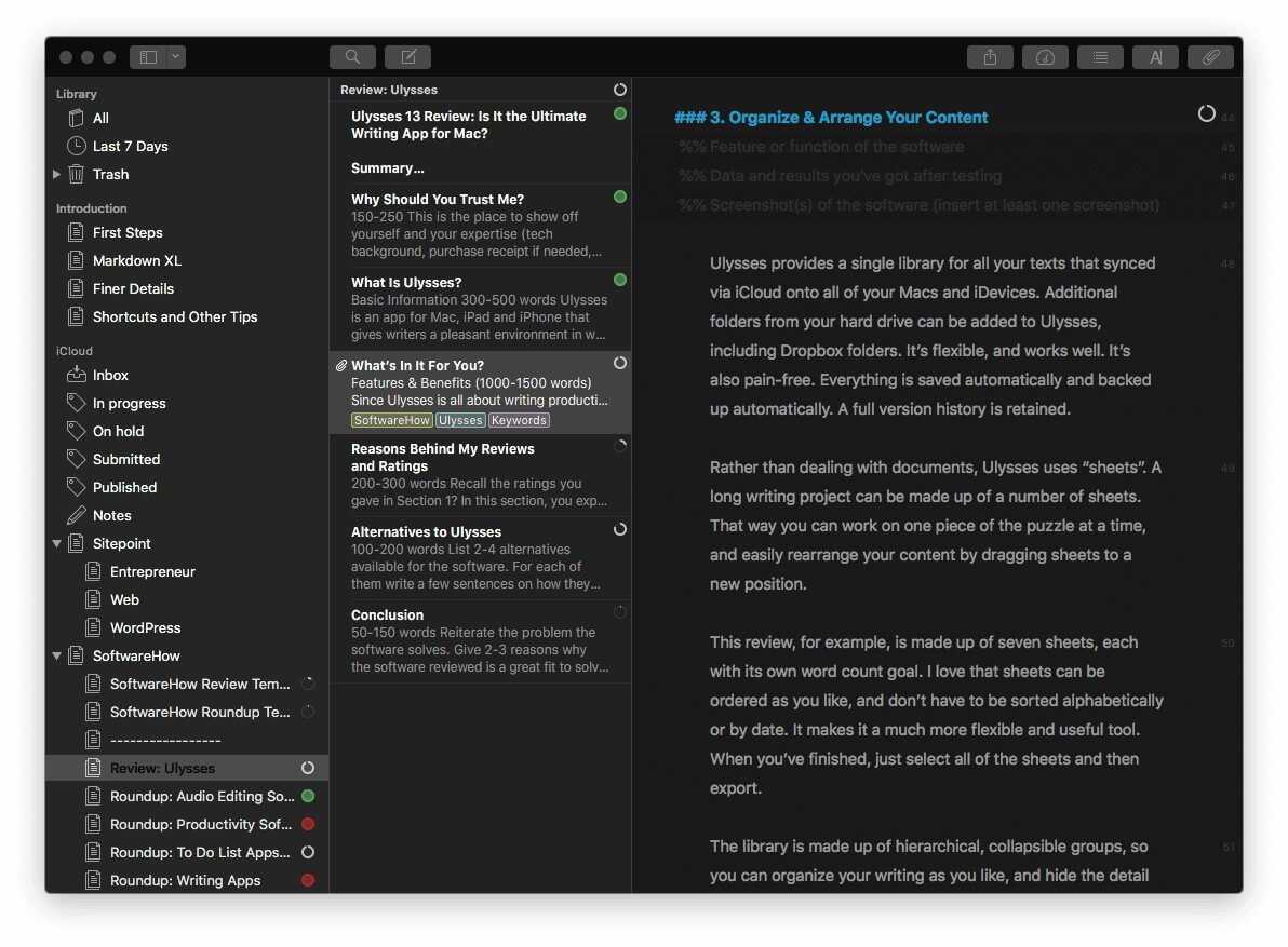
Ulysses lets you break up a document into “sheets” that can be easily rearranged by drag-and-drop. Each sheet can have its own word count goals, tags, and attachments.
Scrivener does something similar, but calls them “scrivenings”, and implements them in a much more powerful way. Rather than a flat list of sheets, each section is organized in an outliner.
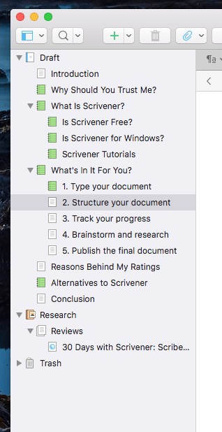
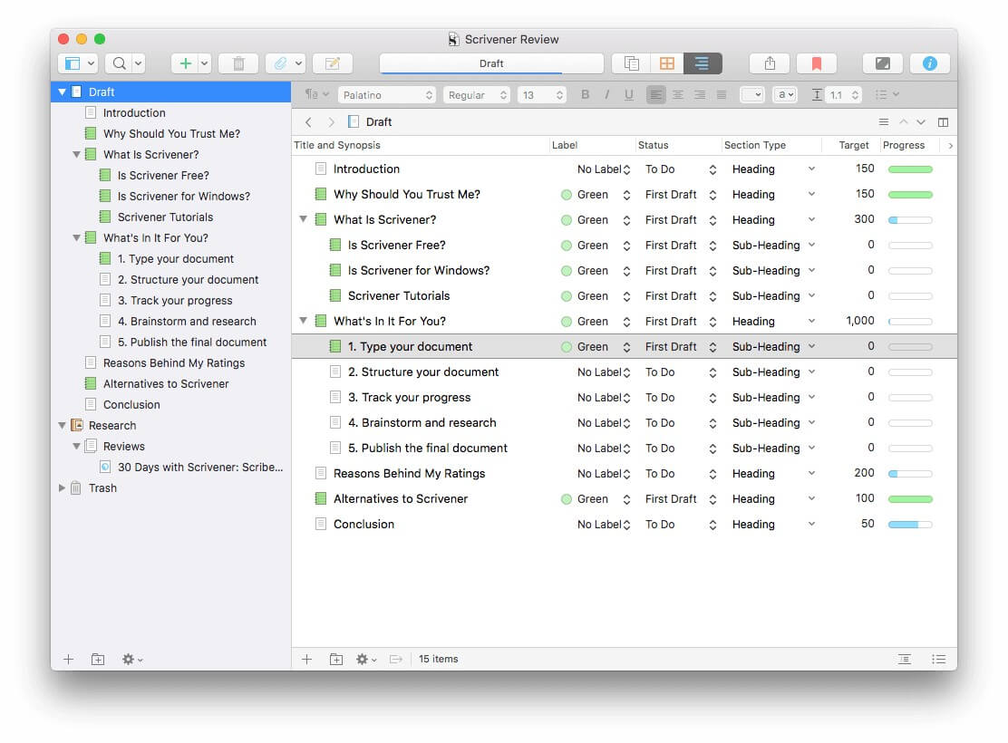
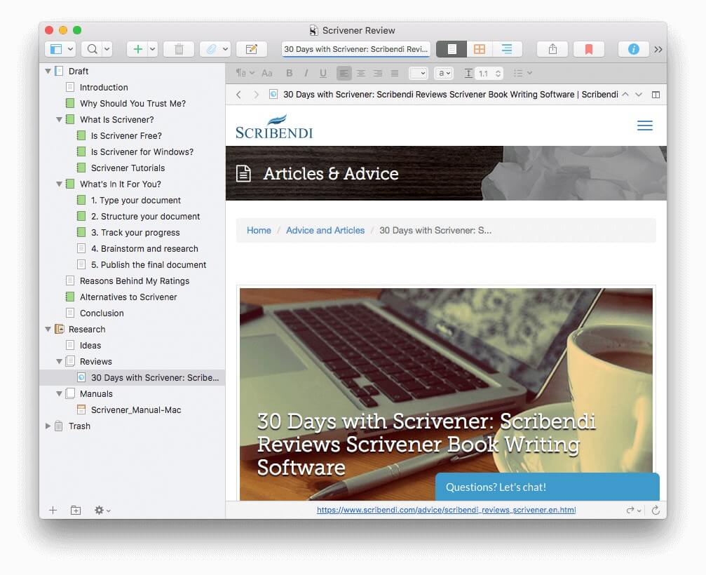
This outline can be seen in the “Binder” on the left at all times, and can also be displayed in the writing pane with multiple columns, giving you a fantastic overview of both your document and your progress.
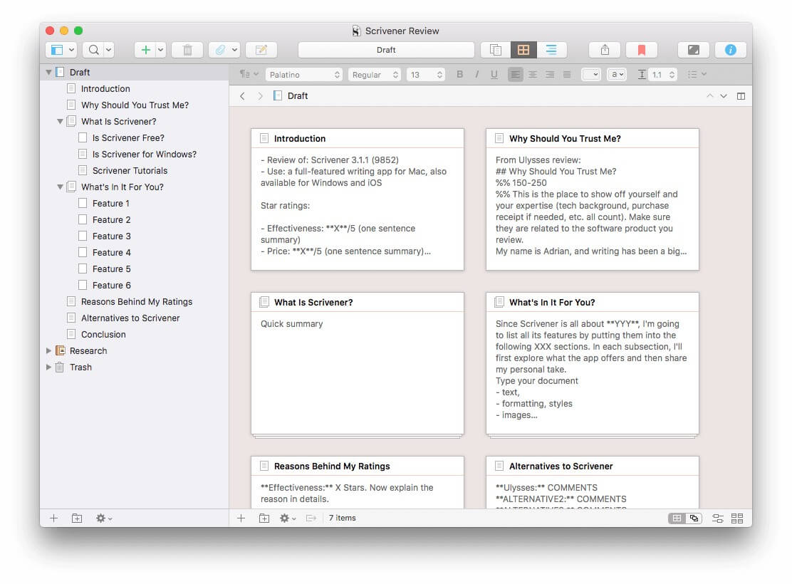
For another type of overview, Scrivener offers a Corkboard. Here you can create a synopsis for each section, and move them around by drag-and-drop.
Winner: Scrivener’s Outline and Corkboard views are a big step up from Ulysses’ sheets, and give you an excellent overview of your project that’s easy to rearrange.
4. Brainstorming & Research
When working on a writing project, it’s often important to keep track of facts, ideas and source material that are separate to the content you are creating. Scrivener does this better than any other app that I know.
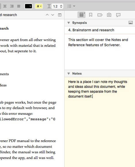
Ulysses is no slouch, though. It allows you to add notes and attach files to each sheet. I find it an effective place to jot my own notes and add source material. I sometimes add a website as a link, and other times turn it into a PDF and attach it.
Scrivener goes much further. Like Ulysses, you can add notes to each section of your document.
But that feature barely scratches the surface. For every writing project, Scrivener adds a Research section in the Binder.
Here you can create your own outline of reference documents. You can write down your own thoughts and ideas, using all of Scrivener’s formatting tools and other features. But you can also attach web pages, documents, and images to that outline, viewing the contents in the right pane.
This allows you to create and maintain a complete reference library for every project. And because it’s all separate from your writing, it won’t affect your word count or final published document.
Winner: Scrivener does reference better than any other app I’ve used. Period.
5. Tracking Progress
There’s a lot to keep track of when you’re working on a large writing project. First, there are deadlines. Then there are word count requirements. And often you’ll have individual word count goals for different sections of the document. Then there’s keeping track of the status of each section: whether you’re still writing it, it’s ready for editing or proofreading, or it’s completely finished.
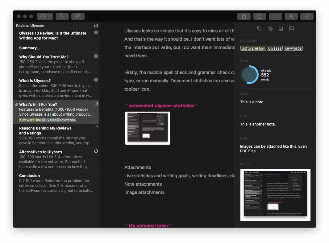
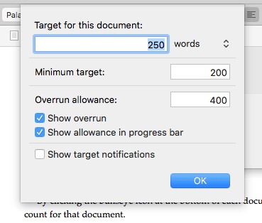
Ulysses allows you to set a word count goal and deadline for your project. You can choose whether you should write more than, less than, or close to your goal count. As you write, a small graph will give you visual feedback on your progress—a circle segment will show you how far you’ve come, and will become a solid green circle when you meet your goal. And once you set a deadline, Ulysses will tell you how many words you need to write each day to meet the deadline.
Goals can be set for each section of a document. It’s encouraging to see them turn green one-by-one as you write. It’s motivating and gives you a sense of accomplishment.
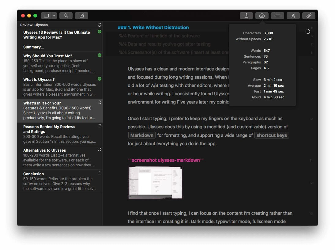
More detailed statistics can be seen by clicking an icon.
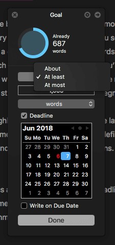
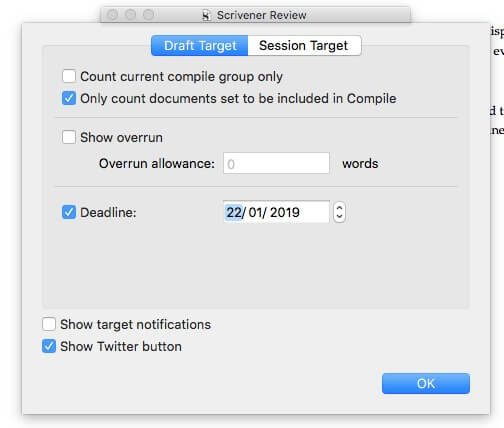
Scrivener also allows you to set a deadline for your entire project…
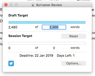
…as well as a word count goal.
You can also set targets for each subdocument.
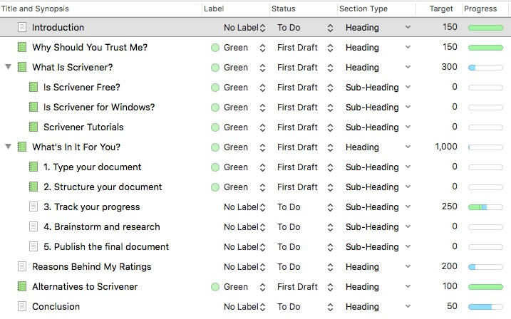
But unlike Ulysses, you don’t get visual feedback on your progress unless you look at the outline view of your project.
If you’d like to track your progress further, you could use Ulysses’ tags to mark different sections as “To Do”, “First Draft”, and “Final”. You could tag entire projects as “In Progress”, “Submitted” and “Publish”. I find Ulysses’ tags very flexible. They can be color-coded, and you can set up filters to display all documents containing a particular tag or group of tags.
Scrivener takes the approach of giving you a number of ways of achieving this, leaving you to come up with the approach that best works for you. There are statuses (such as “To Do” and “First Draft”), labels, and icons.
When I use Scrivener, I prefer to use different colored icons because they are visible at all times in the Binder. If you use labels and statuses you need to go to the outline view before you can see them.
Winner: Tie. Ulysses offers flexible goals and tags that are easy to use and easy to see. Scrivener offers additional options and is more configurable, leaving you to discover your own preferences. Both apps allow you to effectively track your progress.
6. Exporting & Publishing
Once your writing project is complete, both apps offer a flexible publishing feature. Ulysses’ is easier to use, and Scrivener’s is more powerful. If the exact look of your published work is important to you, power will trump convenience every time.
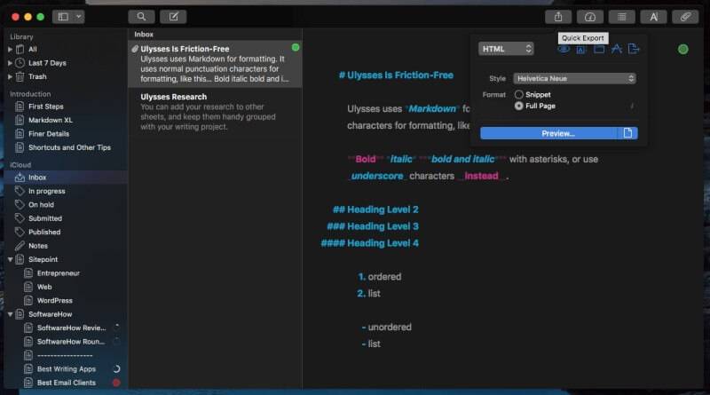
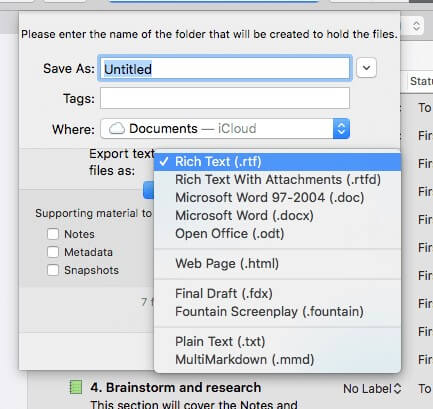
Ulysses offers a number of options for sharing, exporting or publishing your document. For example, you can save an HTML version of your blog post, copy a Markdown version to the clipboard, or publish right to WordPress or Medium. If your editor wants to track changes in Microsoft Word, you can export to that format or a variety of others.
Alternatively, you can create a properly formatted ebook in PDF or ePub format right from the app. You can choose from a wide number of styles, and a style library is available online if you need more variety.
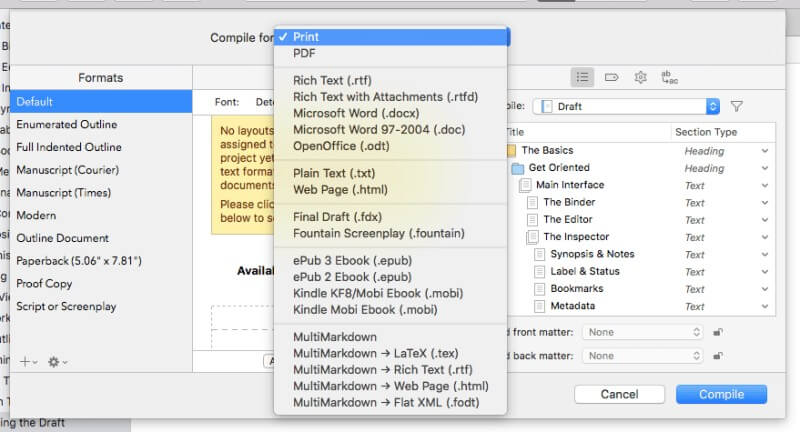
Scrivener has a powerful Compile feature that can print or export your entire project into a wide range of formats with a selection of layouts. Quite a number of attractive, predefined formats (or templates) are available, or you can create your own. It’s not as easy as Ulysses’ export feature but is much more configurable.
Alternatively, you can export your project (or part of it) to a number of popular formats.
Winner: Scrivener has some very powerful and flexible publishing options, but be aware they come with a steeper learning curve.
7. Extra Features
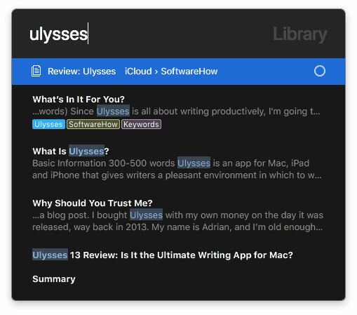
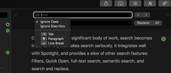
Ulysses offers a number of useful writing tools, including a spell and grammar check, and document statistics. Search is quite powerful in Ulysses, and that’s particularly helpful since the library contains all of your documents. Search is helpfully integrated with Spotlight and also includes Filters, Quick Open, library searches, and find (and replace) within the current sheet.
I love Quick Open, and use it all the time. Just press command-O and start typing. A list of matching sheets is displayed, and pressing Enter or double-clicking takes you straight there. It’s a convenient way to navigate your library.
Find (command-F) allows you to search for text (and optionally replace it) within the current sheet. It works the same as it does in your favorite word processor.
Scrivener, too, has a number of useful writing tools. I’ve already mentioned the app’s customizable outliner, corkboard and research section. I keep finding new treasures the longer I use the app. Here’s an example: when you select some text, the number of words selected is displayed at the bottom of the screen. Simple, but handy!
Winner: Tie. Both apps include helpful additional tools. Ulysses’ tend to be aimed at making the app more nimble so you can speed through your work, while Scrivener’s are more about power, making it the de-facto standard for long-form writing.
8. Supported Platforms
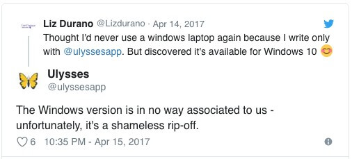
Ulysses claims to be “the ultimate writing app for Mac, iPad and iPhone”, and its ambitions stop there. It’s only available for Apple users. If you do come across a Windows version, avoid it like the plague: it’s a shameless rip-off.
Scrivener, on the other hand, offers versions for Mac, iOS, and Windows so has a broader appeal. The Windows version was launched later, in 2011, and still lags behind.
Winner: Scrivener. While Ulysses is aimed squarely at Apple users, Scrivener also includes a Windows version. Windows users will be happier once the new version is released.
9. Pricing & Value
Ulysses switched to a subscription model a few years ago that costs $4.99/month or $39.99/year. One subscription gives you access to the app on all of your Macs and iDevices.
By contrast, Scrivener is committed to avoiding subscriptions, and you can purchase the program outright. The Mac and Windows versions of Scrivener costs $45 (a little cheaper if you’re a student or academic), and the iOS version is $19.99. If you’re planning to run Scrivener on both Mac and Windows you need to purchase both, but get a $15 cross-grading discount.
If you just need a writing app for your desktop computer, purchasing Scrivener outright costs a little more than a single year’s subscription of Ulysses. But if you need a desktop and mobile version, Scrivener will cost around $65, while Ulysses is still $40 a year.
Winner: Scrivener. Both apps are worth the price of admission if you’re a serious writer, but Scrivener is significantly cheaper if you are using it for multiple years. It’s also the better choice if you are anti-subscription, or suffering from subscription fatigue.
Final Verdict
If Ulysses is a Porsche, Scrivener is a Volvo. One is sleek and responsive, the other is built like a tank. Both are quality apps and are a great choice for any serious writer.
I personally prefer Ulysses and feel that it’s the best app for short-form projects and writing for the web. It’s a good choice if you prefer Markdown and like the idea of a single library that contains all of your documents. And its Quick Export is much simpler than Scrivener’s Compile.
Scrivener, on the other hand, is the best tool for long-form writers, especially novelists. It will also appeal to those looking for the most powerful software, those who prefer rich text over Markdown, and those with a dislike of subscriptions. Finally, if you use Microsoft Windows, Scrivener is your only option.
If you’re still not sure which to choose, take them both for a test drive. Ulysses offers a free 14-day trial, and Scrivener a more generous 30 calendar days of actual use. Try creating a larger document out of separate pieces, and spend some time typing, editing, and formatting in both apps. Try rearranging your document by dragging the pieces around, and see whether you prefer Ulysses’ Quick Export or Scrivener’s Compile for creating a final published version. See for yourself which best meets your needs.


I see I supposedly made a comment here… false. Fake advertising. I can tell it is me and not another “John Brennick” because the link is associated with the platform I formerly worked on, a platform that is completely shut down. Please delete immediately.
In my 34 years I believe that this is the first time I have ever commented on a blog post. I just want to say that after weeks of research, trial and error, and trying to figure out which writing program to go with – this is the best article I’ve come by. I could not get myself to enjoy Scrivener. I like working on multiple books at the same time, and so its library interface doesn’t work well for me. I was really trying to make it work because it’s supposedly the holy grail of writing programs – but maybe the holy grail just isn’t for me. Anyway, thank you.
Hi Adrian, thank you for this great and deep review. The way in which it’s structured and how detailed the comparison is, helping a lot to understand the differences between this two applications. For me, it is difficult decision to choose between Ulysses and Scrivener, because of the simplicity and better focus build in Ulysses. But all other features like research, corkboard and better compiling are tempting, keeping for me in mind that I’m working on a novel. Two things which I dislike on Scrivener, are how it handles the dark mode on MacOS and overloaded UI in Microsoft Word style. For now, it continues to be a hard choice, but with slight tendency toward Ulysses.
I feel *exactly* the same way as Sergej!
Thanks for the great comparison review. You really captured the essence of both programs based on my previous experience with both programs.
The problem we ran into is that some folks in my company were Windows only, so that precluded Ulysses – which is too bad since I think ‘easier’ would have been better for us. At the time, Scrivner was still in beta for 3.0 and had too many bugs. We just couldn’t get the compiler to consistently meet our needs. I really like the idea of the compiler, but it just didn’t work well for us (at least, at that time). We ended up sticking with Microsoft Word and I wrote a simple “compiler” using VBA.
Two more comments:
– I don’t think either program did a great job of letting us share a project between multiple users. We found a way to make it work, but it wasn’t great.
– Ulysses is now part of Setapp (https://setapp.com/). I only thought I’d try Setapp for a year when they ran a discount, but it’s really turned out to be a great deal. (Note, I’m not affiliated with Setapp in any way.)
Thanks for this extremely helpful comparison. I’ll take your advice to try both using their free trials.
Dear Adrian,
I’m about to start a master’s and I don’t know which is better for writing a thesis. Can you help me with my decision. I will appreciate your advice. Maybe you could recommend me any other paid software. Thousands of thanks!
From Colombia,
Sebastián