
Many people start their InDesign journeys by expecting it to function like a word processing app. But InDesign’s focus on typography and design means that it works quite a bit differently, even when it comes to basic operations like making part of your text bold.
The process is still quite simple, but it’s worth taking a look at why InDesign is different.
Table of Contents
Key Takeaways
- Bold text in InDesign requires a bold typeface file.
- Stroke outlines should not be used to create fake bold text.
- Bold typefaces for use with InDesign are available from Adobe Fonts for free.
Creating Bold Text in InDesign
In many word processors, you can simply click the Bold button, and instantly your text is bold. You can also quickly create bold text with InDesign, but only if you have a bold version of the selected typeface installed on your computer.
The quickest way to bold text in InDesign is to use the bold keyboard shortcut.
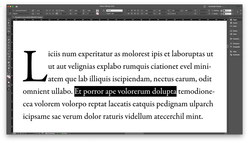
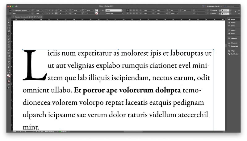
Select the text you want to bold using the Type tool, and then use the keyboard shortcut Command + Shift + B. If you have a bold version of the typeface available, your text will immediately display as bold.
You can also create bold text in InDesign by using the Character panel or the Control panel that runs across the top of the document window.
When you have a text frame object selected, the Control panel replicates all of the functionality of the Character panel, so it’s up to you which panel you want to use.
Wherever you choose to do it, this method gives you the ultimate level of control over your bold text, because many typefaces created for design professionals have multiple different bold types available.
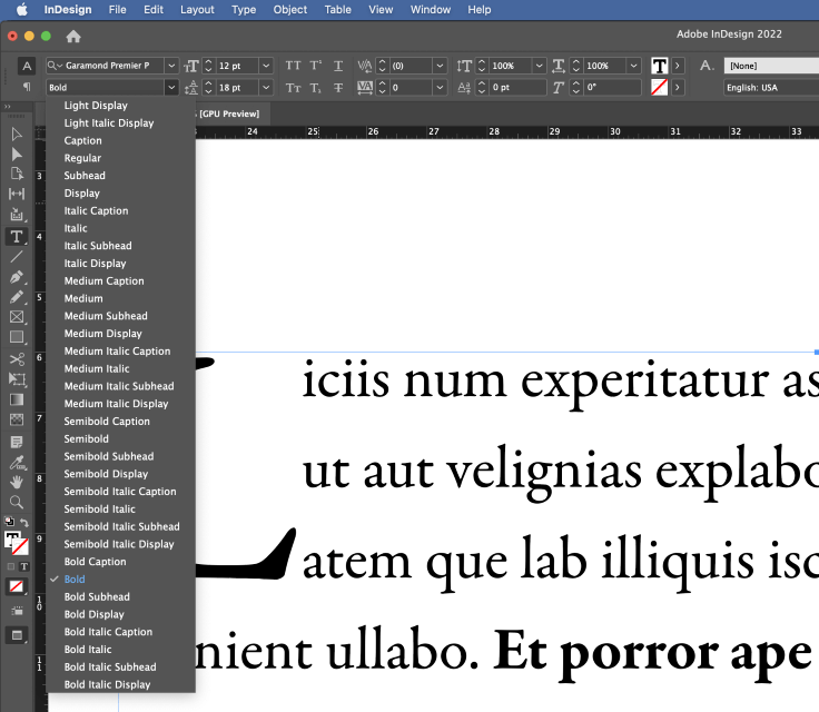
For example, Garamond Premier Pro has four different bold versions, as well as four bold italic versions, not to mention the medium and semibold weights, which offer a huge degree of flexibility for typographic design.
If you want to remove bold, simply choose Regular or another version of the font.
When you want to make text thicker, select the text you want to adjust, and then select the bold typeface you want to use from the dropdown menu.
That’s all there is to it!
Adding Bold Fonts with Adobe Fonts
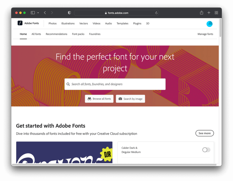
If you want to use a bold font but you don’t have the bold version of your typeface installed on your computer, you should check the Adobe Fonts website to see if you can install one.
Many of the typefaces on Adobe Fonts are available for free to anyone with an Adobe account, and there are over 20,000 fonts available if you have an active Creative Cloud subscription.
Make sure that you’re signed in using your Creative Cloud account. This allows you to install new fonts from the website and have them ready for use in InDesign with just a few clicks.
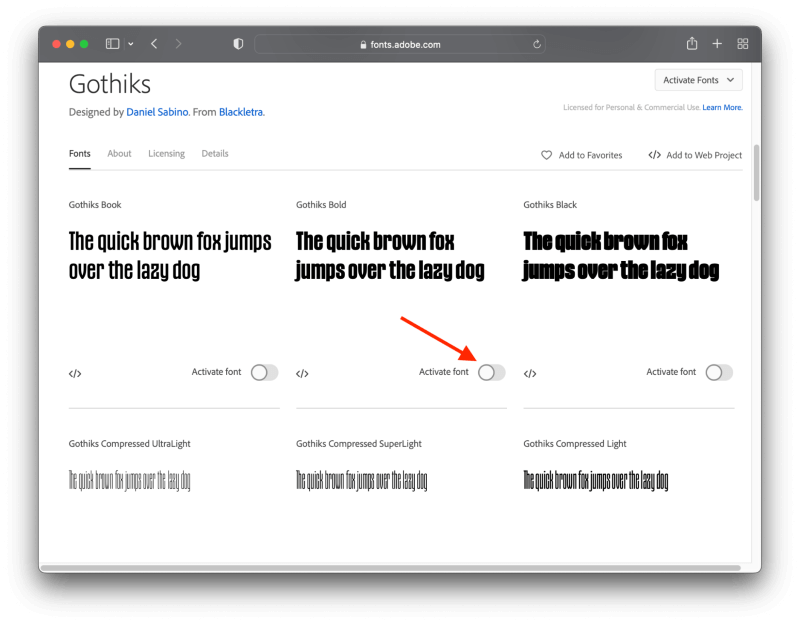
When you find a bold typeface that you like, simply click the slider button to activate it, and it should download and install itself on your computer. If it’s not working, make sure that the Creative Cloud desktop app is running and signed in using the same account.
Not sure how to add new fonts? I have a tutorial on how to add fonts to InDesign that covers all the ins and outs of the process.
Making Bold Text in InDesign the Hideous Way
I need to say right at the start that I do not recommend that you ever do this. I wouldn’t even mention it in this article at all, except that so many other tutorials pretend that it is an acceptable way to change font weight in InDesign – and it is definitely not a good idea, as you’ll see.
InDesign can add an outline (known as a stroke) around any object, including text characters. Adding a line around your text definitely makes it look thicker, but it will also completely ruin the shapes of the letters and may even cause them to overlap each other, turning each word into an unreadable mess, as you can see below.
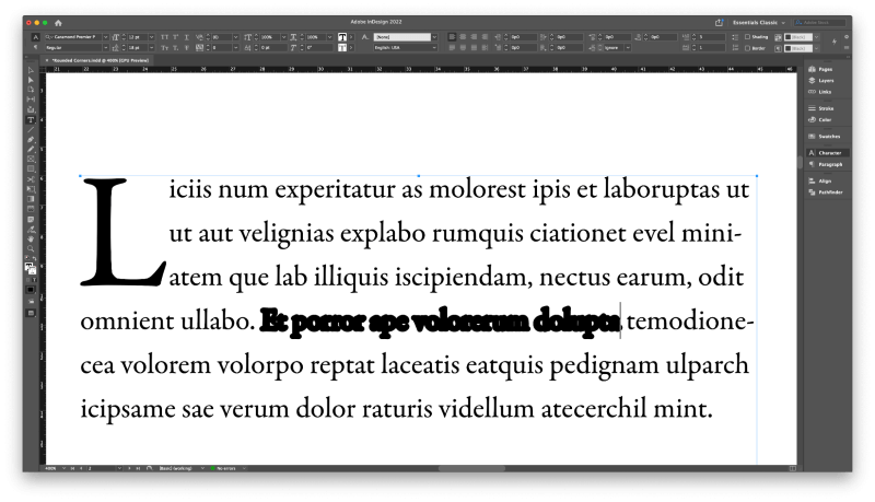
So many tutorials recommend this, but it’s absolutely hideous
Proper bold typefaces are designed to be bold from the very beginning, so the letterforms do not get distorted or cause any display issues when used.
InDesign is a favorite tool of typographers, and no typographer worth the title would ever use the stroke method to make bold text in InDesign because it completely destroys the style of the typeface.
No matter what your skill level is, you probably shouldn’t use it either!
A Final Word
That’s everything there is to know about how to bold text in InDesign, as well as a cautionary tale about why you shouldn’t use strokes to bold text in InDesign.
As you get more familiar with typography and typeface design through your InDesign work, you’ll understand why it’s important to work with well-designed typefaces that offer proper bold versions.
Happy typesetting!