Creating your own Logo in Photoshop is an extremely important step in developing your small business or upping your professional standing through business cards and the like!
While there are many ways we can go about creating this level of branding, we should take the necessary care and attention to crafting the right kind of logo to represent your creative career.
My name is Skyler, and I currently work as a freelance sequential artist while attending my last year at the Savannah College of Art and Design. I’ve got lots of experience creating logos and business cards that are representative of my freelance endeavors as well as my small online shop.
Whether you’re brand new to the business and want to take this step towards professionalism, or you’re simply in the market for a new logo and looking for help rebranding, I’ve certainly got some tips and tricks for you to make it that much better along the way.
Table of Contents
3 Key Logo Design Elements & Ideas
It’s important to know the fundamentals of logo design before actually starting to make a logo. Here are three important things to consider when making a logo.
Attention Grabbing
This is likely the most important piece to remember, outside of accuracy and representation in your design choices. It’s the first impression people get when they see your logo – I like to compare it to that line that hooks you in the first paragraph of a story, and sells you on the book!
You can accomplish this in many ways – most people go for a bold color palette or memorable naming choices. Perhaps you’ve got an out-of-the-box design choice in mind!
Memorability
Memorability can mean many things. You can remember a logo easier if you’ve caught their eye already with that bold palette or otherwise – but if not, we can ensure this is a memorable design by making it a bit minimalistic.
Think of it this way – you’re more likely to remember a simplistic and clear logo as opposed to a busy, complex, and possibly unclear logo.
Accurate Representation
This is important to your branding most of all – it’s how a customer or client can understand the type of services or products you’re offering without having to do any more research into your business.
For example, if I’m selling custom candles then maybe I’d include a rendering of a book, lit by a lone candle. This is a clear message to your customers that you sell something within that general category.
Maximizing Your Logos Potential
For my logo, I wanted something versatile that I could change the color of often to meet my needs.
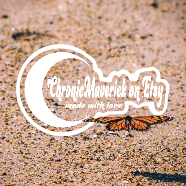
This is an example of the one I use in tandem with my photography! All I did to accomplish this was drop the background color and use a transparent PNG version of my file to paste onto my photograph.

Now, I don’t always use this version for everything. For the products themselves, I stamp them with a nontransparent – and typically black and white version. This is another plus to having a simplified, and versatile logo.
As you can see, the black-and-white versions are very minimalistic, and straightforward. I’ve used them on business cards, branding, and packaging alike.
Text & Typeface
I’ve used the tag Chronic Maverick throughout my creative career, so this will be what I stick with today. You, however, may want to make a mind map or mood board to best inspire your brand name or logo. If you already have one set up, great! We can dive right in.

Once you’ve settled on a name, you can use the Horizontal Type Tool to experiment with Typeface.

If you take a look at the Overhead Panel after engaging the Horizontal Type Tool, then you’ll see you now have access to font type, italics, size, etc. This is where you’ll be doing all the editing for your text and typeface.
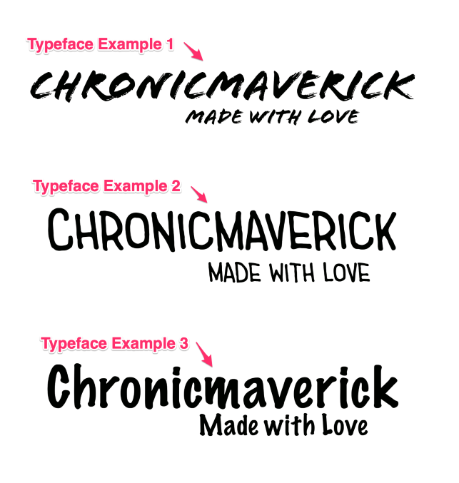
Now, the best advice I have for choosing the correct typeface for your logo is to experiment. For example, I’ve thrown up some of the other typefaces I considered before settling on the final product.
The first one is edgy and looks like paint strokes done by hand. That gives us a very different feel from the second and third more rounded, friendly marker felt typefaces.
You should be considering what these typefaces can convey to your audience, so lay out several of your favorites and find the best fit for your brand identity.
Logo Base and Shape
Now that we’ve selected our typeface and identified what we want to be able to accomplish with this logo, we can begin shaping it! This is something many struggle with by making things more complex than necessary.
Ultimately, don’t be afraid to experiment, but keep in mind not to overcrowd your design as well.
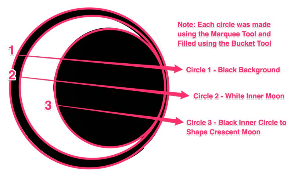
I personally settled on a moon-shaped design as my shop deals with custom arrangements in resin for reading or writing accessories, as well as custom notebooks and stationary. Thus, I opted for a late-night theme, as I associate reading and writing with my inner night owl!


I first selected the Marquee Circle Shape Tool and the Paint Bucket Tool to make the base for my logo. I made three separate circles using the Marquee and Paint Bucket, then overlapped them to create a crescent moon.
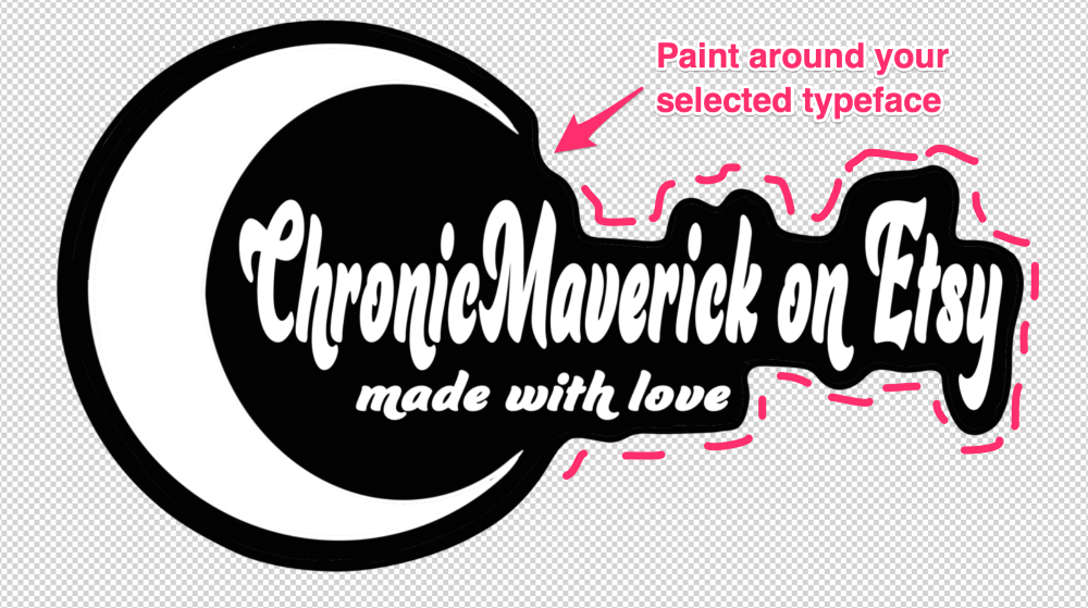
Once you have the base for your logo, you can merge your design with your selected Typeface.
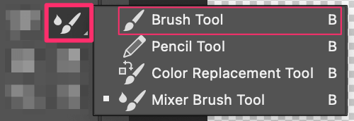
You can accomplish this by using the Paintbrush Tool and painting below your Typeface layer. This serves to merge your original design with your brand name!
Now that you’ve got the base for your logo done, you can begin messing around with color and creating different versions for different products or business cards, etc!
Experimenting With Color
This is the fun part! Here you can use your Paint Bucket Tool again to experiment with different colors, but first I suggest Exporting your original design as a transparent PNG so you have a hard copy of the original.
You may even want to create a duplicate of your project, so you have the PSD file for the original as well.
Here are some examples of different versions of my logo I’ve colored for product tags and business cards.
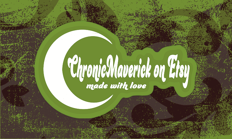
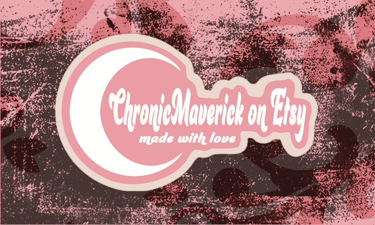
Once you’ve got your design down, you can go crazy with color schemes. I suggest looking up different types of complementary, split complementary, or analogous color palettes and taking inspiration from them!
Above & Beyond: Vectorizing Your Logo
If you have the opportunity, one of the best things you can do is change your logo to a vector image. This means you can scale your image up or down as much as you’d like and the image quality will never change.
This is supremely helpful for marketing, seeing as you can drop your logo onto any product or item without worry. The only drawback is that you’d have to have or download a free trial of Adobe Illustrator (or a similar vector-based program).
If you have access to this or would like to give the program a try, follow along with this tutorial to vectorize your newly designed logo!
Conclusion
So, now we’ve accomplished a logo that is worthy and representative of your business endeavors! Congratulations – this is a monumental step to be taking, and you’re sure to remember it throughout your creative career.
Now keep in mind that this is probably the first of many logos you’ll create, so don’t be too worried about changing your branding or identity as you and your business grow or expand. You may even combine motifs or add new products, skills, or services that can be better represented through new logos.
So don’t be afraid to revisit this article or experiment with elements outside of your comfort zone as you continue your logo creation. It’s sure to elevate your designs and take your creativity to the next level!
